Destash July - Scrap Your Scraps
3:27 PMThis week, as part of my Destash Project, I thought I would focus on a new challenge blog that already has some awesome and amazing content! Scrap Your Scraps is full of creative ideas and ways of using your current supplies. Several of the most recent ideas are ways to use up your ribbon, updating your older supplies with acrylic paint, and using up your leftover thickers! It is really an awesome site and if you have yet to check them out, you really should hop on over! They always seem to inspire me to try something I hadn't thought of. I greatly enjoy the fact that a lot of the focus is on creating handmade embellishments with things that you already own, since I tend to buy a ton of paper and not so many embellishments (those things are expensive!). All of the products used for this Destash Project are part of my July Counterfeit kit. I also have a Pinterest board where you can check out the supplies that I have been using.
Inspiration - Scrap Your Scraps
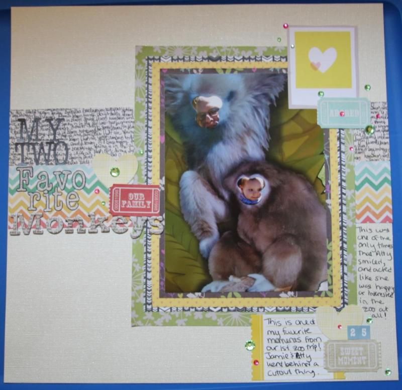
So for this week I started with a selection of layouts from Scrap Your Scraps, that I felt really involved a lot of paper (or paper products), so that I work towards using up my paper stash! And I do apologize for the late blog post, my daughter is teething something horrible this week. So life has revolved around giving lots and lots...and LOTS of cuddles on the couch, instead of Momma getting anything else around the house accomplished!My Two Favorite Monkeys
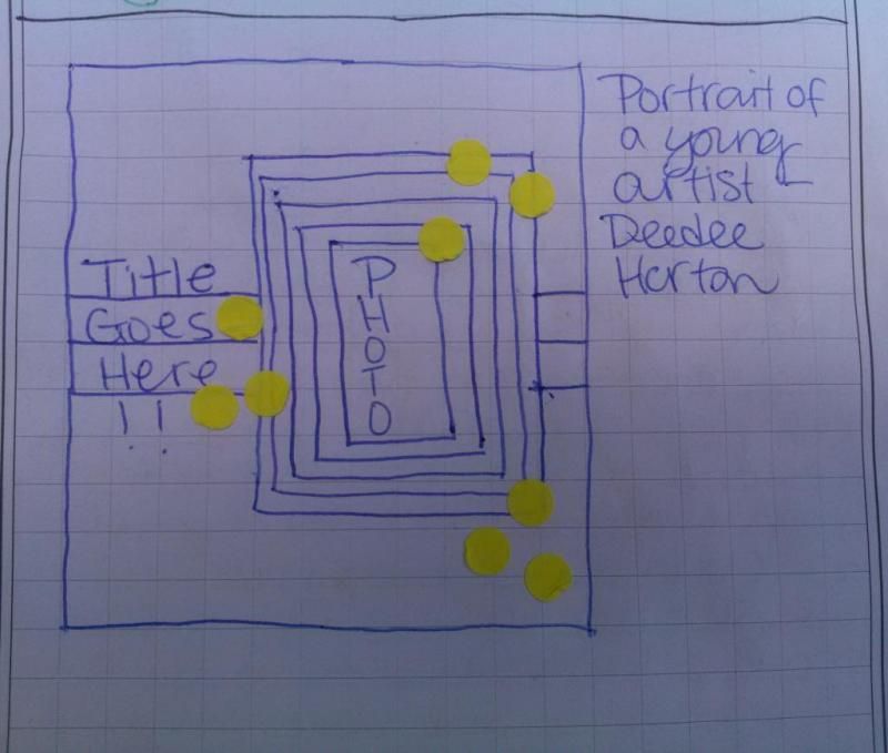
My first layout is inspired by the Layouts - Mixing Old with New post by Deedee Horton. Deedee talks about mixing new trends like Chalkboard with some older paper products to revive and update the older supplies and get them onto some layouts, which of course is an idea I simply love!Here is a quick sketch I did in my journal of Deedee's layout, which you can find at the link above. I loved this layout, because there are four papers used for photo mats, plus then the two strips that go across the paper. What a great way to use up some paper! I decided to use a photo taken in April of my daughter and Jamie from our first trip to zoo. Jamie took her behind one of those wooden board things that you stick your head out of and then magically - you're a monkey! But they're my monkeys anyway :)
Supplies
For this layout I included some Studio G floral print paper that I have struggled to use for a fairly long time, as well as some newer supplies from Studio Calico. I matted the whole layout on a piece of Bazzill cream cardstock. Then I embellished with some of the tickets from the Echo Park Beautiful Life paper, as well as a cut out Polaroid frame from the Dear Lizzy Neapolitan Dreamy Days. I used two more of my cut out hearts from the Amy Tangerine paper. For my title I used alphabets from the Basic Grey Paper Cottage (both styles), and the Memo Thickers. I decided to outline of the polka dot alpha from Basic Grey, because it kind of got lost in the multi-colored chevron from Pebbles. I added some journaling on an Echo Park journaling spot from the Dots & Stripes sticker sheet, #25 from the Nikki Sivvils alpha sheet, and finally finished with a scattering of Studio G gems. I used a total of 8 sheets of paper on this layout, but I only completely used up one (the cardstock background). The rest will get added to the scraps bag for next week's post!Our Blooming Apple Tree
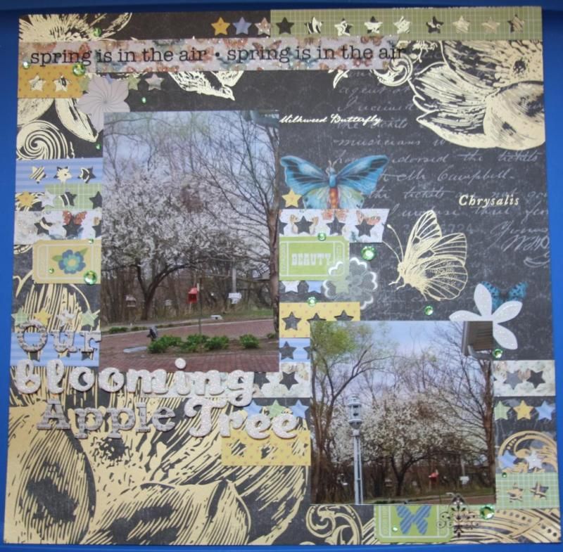
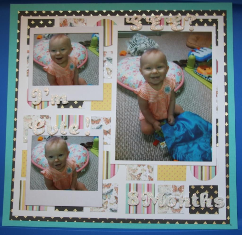
For my second inspiration, I used the post Scrap to Your Hearts Content - Using Your Scraps to Make a Cute Background. I loved two of the layouts in this post. XOXO by Cathy Martin with punched hearts inspired my blooming apple tree layout, and the So Happy by Mandy Reedky inspired my layout about my daughter's "I'm cute" face at eight months old.Supplies
I absolutely loved this gorgeous sheet from the Mariposa stack by DCWV that was gold foiled. I really didn't want to cover a whole lot of so I thought the technique with the the punched out pieces would be perfect. I could only find a small star and a small snowflake punch, though I swear I have a heart somewhere. I still thought the star would look cute so I went with that. For the strips I used a butterfly paper from the Mariposa stack, the Studio calico Hey paper from Snippets which is a green grid and yellow background with pink hearts on the other side. I also used the blue stripe from my Throwback Thursday Bathtime Layout, which is by the Paper Studio. For the embellishments, I cut out some more of the tickets paper from Echo Park (Beautiful Life - Tickets). I also added one of the Spring Sentiments from SRM and a couple of K&Company diecut flowers. Then I finished it off with a diagonal of Studio G green gems. The alphabets that I used for my title are Dear Lizzy - Soiree, and Memo Thickers. I absolutely adore how this layout came out! It's definitely not a typical style for me, but I love the mix of papers and textures that this page has. I used a total of 5 sheets of paper on this layout, but again only used up one (my background paper), so the rest of the paper will go into my scrap bag for next week!I'm Cute! See?
Supplies
For this layout, I used a Bazzil cardstock as my background in Navajo, and then mounted another sheet of the Mariposa stack by DCWV that is a gold foiled fleur di lis. I gutted this sheet and then layered another piece of cardstock, this time white, to arrange my 1.5" squares and circles on. By gutting this sheet, I was able to incorporate it into the squares that I created. For the rest of the squares I used a piece of butterfly paper from the same DCWV stack, and the yellow hearts side of the Studio Calico Hey paper. I also used the Jillibean Soup multicolored stripe (Southern Chicken Dumpling Soup) for the squares and punched some 1.5" circles with it. And I finally used some of my Recollections Polaroid frames! So excited about that one! And I just love how the Dear Lizzy alpha ties into all that gold and glitter that is in the other papers that I used for this layout. I used a total of 5 sheets of paper on this layout and I completely used up two sheets!Finally, I wanted to show you one last inspiration that I just didn't get around to doing a layout for. Nicole Bingaman created a fabulous layout using some super cute banners to create a double page spread in Revisiting Older Products in Your Stash. I so wanted to do a spread inspired by this layout, but time just did not allow. But you should definitely check it out, because its super cute. Plus she includes three other layouts that she created (including a process video) that are adorable and a great way to use up some of that older paper that you still love!
I think I'm carrying on pretty well with my challenge so far this month, despite some hiccups. I have used up a total of 4 sheets of paper, and have a small bag of scraps that I will be focusing on finishing up next week for Scraps Week. This brings my total of paper used to 11 sheets of paper completely gone from my stash so far this month! I hope you'll check it out next week when we divide into the scraps bag and let me know what you think of the layouts so far this month.

5 comments
Those are all great! Really love the layers on the first one and stars on the 2nd. What a cute pie too!
ReplyDeleteWow, you are really productive this month. The destashing is working!!
ReplyDeleteSuper cute layouts and well thought out layouts to use up that stash! Yes I agree the destashing is working for you :)
ReplyDeleteRockin that destash - keep up the good work!
ReplyDeleteI'm loving your de-stashing attitude! (and might have to check out that blog . . .) cute pages, especially loving your little "monkeys" . . .
ReplyDelete