life
photography
project life
scrapbooking
Project Life Title Page & Plans
7:15 PMI am very excited to be doing Project Life in 2014. This will be my second year of doing the project. I learned quite a bit during my first year of the project.
I have learned :
- That I absolutely love this project
- That I work best when I have two or three weeks worth of pictures ready to go
- That I like having notes about the weeks to refer to
- That I really like variety and mix/matching different sizes (8.5x11, 12 x 12, 6 x 12) and pocket styles (PL A through whatever, SNAP styles, Echo Park Styles, etc)
In 2013, I used a lot of manufactured pocket style cards, specifically from MAMBI, We R Memory Keepers, Echo Park, and Simple Stories. In 2014, I want to really knock out my stash. I have a ton of paper that can be used to make filler and journaling cards.
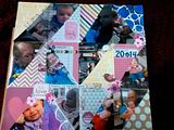
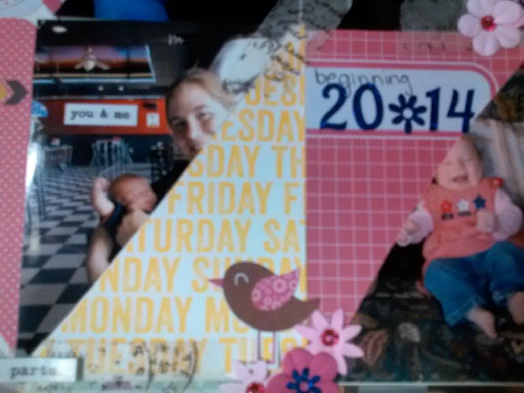
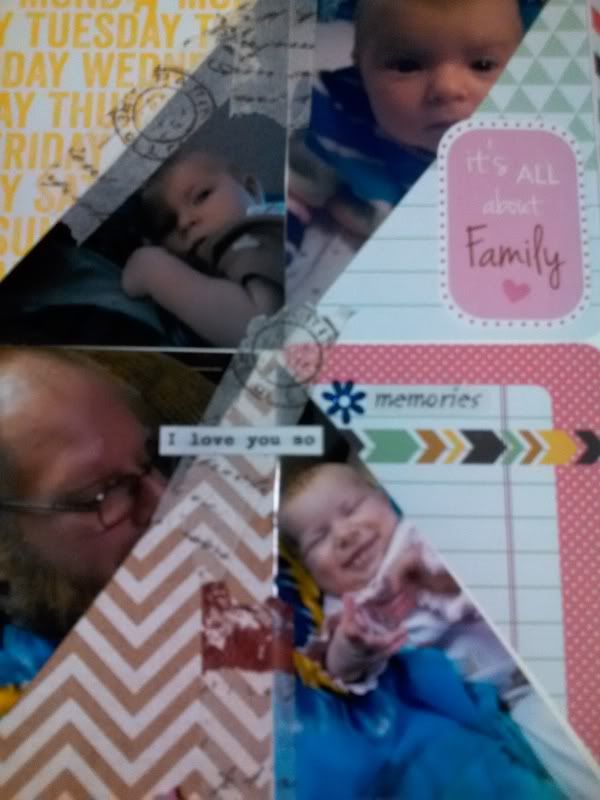
For my project life 2014 title page I was inspired by Elise Blaha. Check how she did her title page! She used the trend of triangles to do some really creative stitching and cut her journaling cards and photos into triangles. I loved it. It was so super graphic and it made me so excited for the new year!
So for my title page I used some of my project life card stash (it was mix of Echo Park, We R Memory Keepers, and some homemade cards that I made with using stencils and Dylusion sprays). These items were not in my January Kit, however, I wanted to use them so... ya know... I did not use a pocket protector like Elise did, instead I just glued down my cards onto a 12 x 12 sheet of white cardstock.
In addition to these supplies, I took several photos and cut them into the matching triangles, based on the photos and how they would look best cut. However, my cutting skills aren't the best. So I used my Tim Holtz tissue paper washi to fill in some of the gaps. Then I decorated it up using my Studio G mini flowers, Ki pink gems, Sticko vellum phrase sticker (the word memories), a couple of Ki cardstock stickers (Hello Love, It's all about Family, and the little bird), and I added some of the tiny text scattered across the page. I simply love how it turned out. Trust me, this is an improvement, because I hated it once I had the pictures down on the page. But after some problem solving and embellishing the page, I think its adorable!
Now you have probably noticed that I said "Project Life" title page. And you are probably yelling, "but where are the pocket page protectors??" Well my project life plan this year is to intermix regular 12 x 12 layouts with the pocket pages and maybe different size layouts (6x6, 8x8, 6x8, whatever I have around). Plus, I don't currently have pocket page protectors. I need to pick some up. However, I do want to still play around with the Project Life pocket page styles so I will be incorporating some of the other styles onto some 12 x 12 pages. You will see a greater variety using this method (think of the pocket designs as sketches) than Design A (4 4x6 photos and 4 3x4s), which is pretty much what I ended up using for the last couple months of 2013. I love all the new styles of page protectors that have come out, but I can't rationalize buying 12 or whatever the packs come in. By simply incorporating the designs onto a 12 x 12, I can take advantage of all the new sizes and products that are meant to fit in to the pockets and still have my speedy scrapbook time. You might think I'm crazy, but I am loving this idea.
My plan is also to do monthly divider layouts for my overflow of photos. Let's be honest. I take way too many photos to do a 2 page Design A spread a week. I really do. It's crazy. It doesn't allow me room to journal or embellish and I was getting bummed out. I want the freedom to say, "hey, I want to do a full page layout on Atty playing with her toys" and I want to be okay and enjoy that experience. It's been years since I 12 x 12 scrapbooked. I may only end up making a couple layouts and then jumping back to pocket pages only. Who knows!
But this is my challenge for the year:
- Incorporate multiple size layouts - I loved this in my December Daily
- Use up my stash of products, no core kits, but predominately homemade counterfeit kits
- Use monthly dividers to "stay caught up", without having to feel like I can't do full page layouts
- I'm following a Shimelle-like attitude of scrapbooking chronologically, but whatever I want, whenever I want, and simply putting the pages into the scrapbook so that it is a finished product at all times - no pushing feeling of being behind or guilty!
- Play and have fun with my pictures
What are your Project Life plans? What are you doing differently this year? I would love to know!


0 comments